Back in 1979, Jean-Pierre Luminet created the first "image" calculated the using the IBM 7040 mainframe but drawn by hand plotting points on paper with black India ink.
The image is fantastic but one of the things that makes the story cooler, I think, is that even in 1979 the IBM 7040 was something of a relic. Although only introduced in 1963, it was superseded as early as 1964:
It looks straightforward. Skipping basically all the maths, it's equation 19 in the paper. Each contour is a line of constant z (flux), plotted in polar coords:
You plug in the viewing angle, black hole mass and some other constants which are defined in the paper (might need some fiddling to get them to look nice).
Then I think the plotter is just some monte carlo sampling and then inverted.
Off topic, but that link doesn’t work because it redirects through guce.advertising.com and I use a pi hole. I wonder if it was a deliberate decision to redirect traffic away from the site to an ad server to have it redirect back after trackers are set. Maybe they don’t care that they lost the adblock users. Still, it seems like there’s a better way than to redirect all traffic away. That makes no sense to me.
Interesting. I wonder if the asymmetry in Luminet's image is due to Doppler effect (redshift on the darker right side, blueshift on the ligher left side), then why does the modern simulation not show it? Matter in the accretion disk does move at relativistic speeds after all.
The astronomical news community would do the public a very big favor if they started stating clearly which pictures are taken by telescopes and which are cgi.
That and including a standard scale for apparent width.
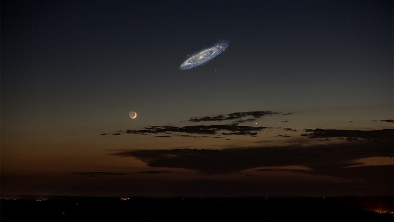
I always thought that photos of other galaxies resolved into specks the size of stars in the night sky. This composite of Andromeda and the moon blew my mind: https://apod.nasa.gov/apod/ap061228.html
Andromeda side to side is ~6 times the width of the moon, IIRC.
Just imagine being able to see that galaxy clearly! In fact (he says bitterly) just imagine being able to seem the damn stars any more. If you've never had a chance to see them, on a moonless night without artifical light wrecking everything, and have the chance to see infinity slowly unfold like a flower as your eyes adjust and take in more, watching the ethereal edge of the milky way appear in greater and greater detail, then you have missed one of the most beautiful sights that exist. Perhaps the most beautiful, perhaps. It really is that special.
But that isnt what you would see by eye or even a normal telescope. That is a long-exposure image. By eye you can only see the brighter/smaller core. Get a more sensitive camera, something able to see the diffuse gas and dimmer stars, and andromeda would be twice even that size.
I think the goal is to get a better sense of "how much of my visual space would this object occupy if I could see it". I had no idea Andromeda would appear larger than the moon from here if I could see it with my naked eyes. That really helps me get a sense of the size.
"Wow, it's that large even though it's that far away!?"
You're right! But I tried tonight just to see if it was possible to see anything at all. My eyes are kind of shitty but we live out in the boonies with no light pollution. There's a little 'yellow brick road' of stars that lead you to it and if i looked slightly aside i could juuuuuuuuust make out the slightest smudge where it is supposed to be. It was right on the edge of my ability to perceive it, need to try again after spending an hour in the dark.
Several galaxies have angular diameters when viewed from Earth of more than 1 degree. The Large Magellanic Cloud is 11 degrees! None of the planets in our solar system are anywhere near this big in the sky - the Moon is only half a degree.
Getting a brighter picture of something that's dim just requires collecting more light - essentially taking a longer exposure. But getting a sharper picture of something that's very small in the sky is limited by both the aperture of the telescope (the diffraction limit) and the atmospheric distortion, if you're viewing from the ground.
Surely there is nothing too strange about this? A light house can be seen from very far away, but you need not drop your keys very far away in a parking lot before they become impossible to find.
Think of what it "was" when your grandparents were young!
In the 1910s, the observables were extremely faint visible-light nebulae, with M13 (Hercules) closely comparable to M33 (Triangulum), although the spiral structure and larger solid angle of the latter was known since 1850: http://www.messier.seds.org/more/m033_rosse.html (This only about five years after the first known resolution of nebulae into elliptical, spiral, and irregular; at the time the linked sketch was drawn there were enough observations of spiral nebulae to decide that M33 must be one as well).
Observations were consistent with an extragalactic but nearby star cluster.
Better observations led to an evolution of what, retrospectively, M33 "was": from closely comparable with M13 to more than a hundred times further away (~ 6.8 vs ~ 850kpc), and tens of billions rather than hundreds of thousands of stars.
Perhaps it's best to think of "was" and "is" in relation to human observations. (This also comes up whenever someone objects to talking in the present sense about today's observations of objects at kiloparsec distances, as in "Sag A* is noisy today" provoking "no, it was noisy 26 000 years ago!" -- and of course hypotheses about what exactly generates the Sag A* observables have not fossilized yet).
There are still large uncertainties about the exact structure of our own galaxy, but the (cosmological) Copernican principle is alive and well in that area of galactic astronomy since galaxy zoos are full of various subtypes of dusty spirals.
I understand that they were using the best models available at that time, and with better equipment it was posible to get a better model so the image got outdated.
> The astronomical news community would do the public a very big favor if they started stating clearly which pictures are taken by telescopes and which are cgi.
I agree that there ought to be clearer indications of which images come from sensor data and which are purely simulated, but all sensor images are heavily processed. I worked on Mars Global Surveyor, Mars Odyssey, MRO, LRO, and other NASA missions, and wrote image processing software for various instruments on those spacecraft (primarily infrared cameras).
They're not simply snapshots like you'll get from your DSLR. Even the most DSLR-like cameras tend to image in many spectral bands (e.g. 11 bands ranging from infrared through visual into UV). An image you see in a magazine typically selects three spectral bands and assigns them to red, green, and blue.
Almost none of the images you see are true color, in part because almost none of the instruments have 3-band RGB sensors like you might see in your DSLR. There are many reasons for this, but the two biggest ones are that much of the universe is opaque to visual frequencies (you need infrared or other sensors to penetrate clouds of dust), and much of the scientifically interesting data isn't present in the visual spectrum (infrared is used to determine mineral composition, like finding hematite on Mars, which is evidence of water in the past).
Images of the surface of planets comes from a complex stitching-together of long, thin strips of data (again in many non-visual frequencies), which are taken from different angles, at different times of day. In order to create the uniform, visually-appealing (and also scientifically-valuable) images of the surface of Mars that you see, the images are heavily processed to balance albedo and adjust other anomalies. One little-known fact is that gravitationally, none of the large, rocky celestial bodies are spherical; the moon in particular is a very lumpy potato shape. This means that an orbit around the moon is nowhere near a perfect ellipse; it wobbles up and down all the time, which means the distance of the camera from the surface changes all the time. All of this has to be compensated for. During processing, everything is stretched to align, and hundreds/thousands of images of the same region from different times (over many years) are averaged together to get the final product.
All of this is a long way of saying that literally every astronomical image you've seen is computer-generated and heavily processed. There's value in knowing which images started with sensor data and which are pure simulation, but there's no value in non-computer-generated imagery.
It's hard to explain this quickly in an image caption. We used to have to deal with conspiracy quacks all the time, demanding that we release the "real images" rather than our "manipulated images" so that they could find the aliens on Mars, but the simple truth is that there are no "real images". It's all sensor data in a form that is completely useless without extensive processing.
I totally get what you're saying. What I was trying to point out is that an image caption saying something like: "This is composite image created using bands x, y and z converted to their approximate color and corrected for albedo variations due to the time and position of the different exposures.", or saying: "This is an artist rendition.", would be great.
I get that there can be discussion of whether or not the processed image data is or isn't an accurate depiction of reality. Sometimes the raw images are good enough to release without any processing. Sometimes the 'raw' image has so much processing and generation of new data done to it to even get to an image (that latest black hole photo being a good example), that it would be disingenuous (at least in my eyes) to call it an 'image acquired using a telescope'. This is indeed a good discussion to have.
My point is however that news sites can't just leave out their image captions and let the public guess about it. That's the worst option. Best would be clear image descriptions, so that at least the public knows what it's looking at. Even if those image captions don't fully convey the complete process of how the image was acquired and processed, but just a short synopsis of the process.
Awesome, but also oddly familiar. Does this new simulation add anything to Kip Thorne's black hole simulation[0] as soon in Christopher Nolan's movie Interstellar?
Not really, they are both the same sort of pop-cultural prop. I think one does include a bit of the blue shifting effects of the disk, a prominent effect they left out of interstellar.
There were 2 major events when this became to regular people who were interested in black holes. First was the Interstellar movie, and the second was the black hole picture by the Event Horizon telescope team. This independent simulation also comes to the same conclusion. In summary, the light from the side of the black hole facing away from us, is also curved back and thrown towards us, when looking at the black hole from the side.
They mean the light emitted by the section of the accretion disk that is behind the black hole takes a path such that it meets the observers eye. I. e. space is curved so that we can see behind the black hole.
The photon ring is just one possible stable orbit. Just like there is nothing that forces all the stars to orbit our sun, there is nothing forcing the universe to place all the photons in the universe into one stable orbit around a black hole.
If I remember correctly Nolan consulted with some actual astrophysicists to get it right. Furthermore, they managed to make use of the Hollywood-funded super computer time to get some actual science out of the deal.
Here's a random article I googled discussing the topic: https://www.wired.com/2014/10/astrophysics-interstellar-blac...
Not just any astrophysicist. It was Kip Thorne, who was already an authority in general relativity even before he received the Nobel prize in 2017 for his work on gravitational waves. His works on the movie led to the publication of a scientific paper: https://aapt.scitation.org/doi/10.1119/1.4916949
I was working at the visual effects studio responsible (Double Negative) at the time. I didn't work on that project but it was pretty cool work they were doing, and was in close collaboration with Kip.
The simulation is pretty amazing, but the wording and headline of the article point to what I feel like in science, not just physics, ecology's pretty bad for it too, but the impression I always get from models and simulations is that when they don't match up with reality, somehow reality's wrong and not the model or simulation.
No, this would be the pop science writers looking for click bait. Literally no one I know talks like this and I'm a black hole astrophysicist who actually knows one of the people that made the image.
Lovely. Interestingly, this feature of black holes that they allow you to see what is on the "far side" of the black hole as a result of gravitational lensing was one of the heuristics used by Leonard Susskind to propose the holographic principle in his famous paper, "The World As A Hologram" https://arxiv.org/abs/hep-th/9409089
Note especially Figure 2, Figure 3, Figure 4, used to justify that a two dimensional screen is enough to capture all the information.
Obviously there is a lot more going on -- especially the black hole entropy formula which says that entropy growths with surface area not volume -- to motivate this idea, but I always thought those figures were particularly educational.
Also interesting in this image is that the left side of the disk around the black hole appears brighter than the right side, because the matter in the disk is spinning so fast that you get Doppler beaming near to the speed of light.
The picture is beautiful but I feel that it doesn't convey the right mental model of the black hole.
It would be a great picture to illustrate gravitational lensing, but it's a not so great one for conveying what a black hole is.
From the picture it seems that particles are swirling around in multiple directions, whereas the mental picture you should get is : there is a standard accretion ring but with gravitational lensing visual filter turned on.
A black Saturn wouldn't do it justice. Saturn doesn't bend space as extremely as a block hole does, and it's that extreme bending of space that's the hard part to visualise about a black hole. It's trivial to imagine a black ball with a ring around it, but it's the bending of space and the subsequent bending of light that's the hard part.
Yep bending of light and warping is hard to visualize.
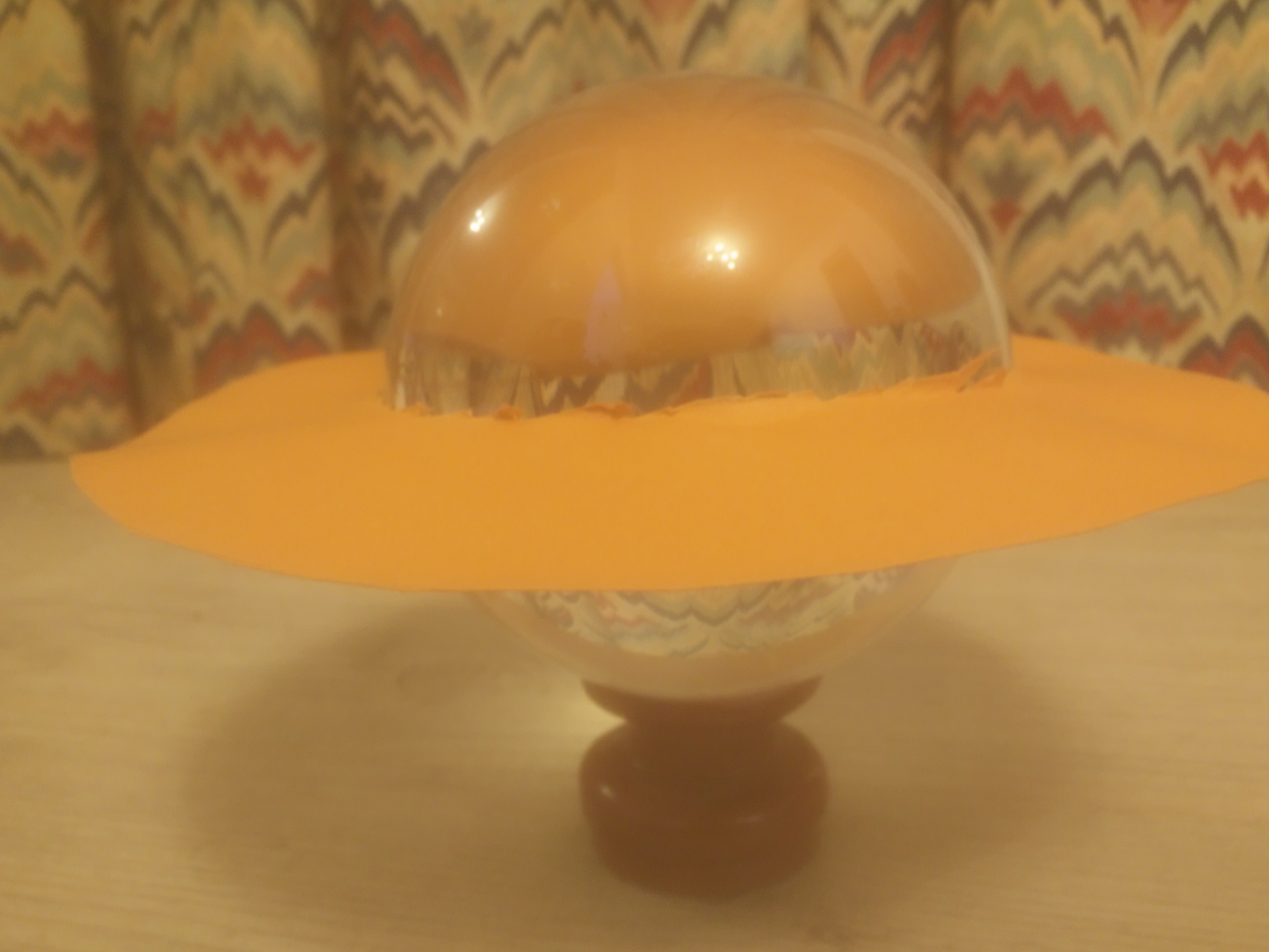
Thankfully we can play with our own black hole at home.
I took my crystal ball cut some cardboard into a ring.
If you look, you can see both side of the ring behind the black hole :
Interesting. I’m amazed how the shape was declared by the notion you would never lose “sight” of the black hole no matter the direction you looked at it from. I just realized that was how the shape came to be.
Distance is not typically the limiting factor. Earth is close enough to the black hole at the center of the Milky Way to be able to see it. The problem is it’s obscured by other stuff, mainly dust.
Might be, black holes come in a very large range of sizes so a configuration where you have a habitable planet very close to a large enough black hole isn't impossible.
Yes! E.g. you can use the sun as a lens during a solar eclipse.
It was actually the experiment that proved Einstein's general relativity to be more than a theory, because during a solar eclipse we can see stars at the edge of the eclipse that are actually _behind_ the sun.
The pic is cool.
https://www.engadget.com/2017/04/19/black-hole-image-jean-pi...